Social Media Aspect Ratios Explained Without the Math Headache
Understand 1:1, 4:5, 16:9 and 9:16 social media aspect ratios, how they affect composition, and when to use each shape.
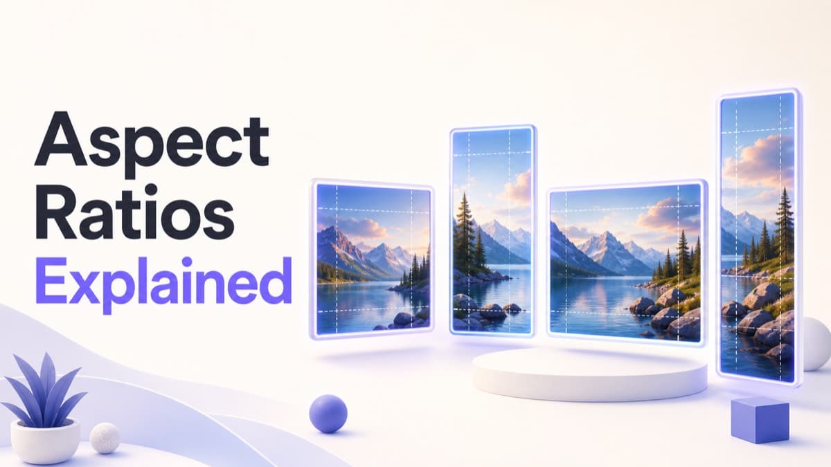
An aspect ratio describes an image’s proportions, not its resolution. The ratio 4:5 means the width is four equal units for every five units of height. An image measuring 1080 × 1350 pixels and one measuring 800 × 1000 pixels share the same 4:5 shape, even though their pixel counts differ.
Why ratio matters before pixel dimensions
If an image has the correct pixel count but the wrong shape, the platform still has to crop, pad or reframe it. Matching the ratio lets you control the composition before upload. Pixel dimensions then determine how much detail the file can preserve.
Four ratios cover many social placements
| Ratio | Shape | Best suited to |
|---|---|---|
| 1:1 | Square | Profiles, flexible feed posts and product images |
| 4:5 | Portrait | Vertical feed posts with strong mobile presence |
| 16:9 | Landscape | Video thumbnails, widescreen visuals and some banners |
| 9:16 | Vertical screen | Stories, Status posts and vertical video artwork |
1:1 square: balanced and reusable
Square images are easy to scan and transfer between feeds, but they are not automatically safe for profile use. A platform may apply a circle over the square file. Keep critical details out of corners and test the circular mask separately.
4:5 portrait: more feed presence
A 4:5 image uses more vertical screen area than a square while remaining a feed post rather than a full-screen Story. It is useful for people, products and editorial images. The added height changes visual balance, so simply extending a square background rarely produces the strongest result.
16:9 and other landscapes: wide storytelling
Landscape ratios suit environments, groups, thumbnails and video-related artwork. On a phone, however, the available height is limited. Use a strong focal point and avoid small type. Some platforms use ratios close to, but not exactly, 16:9, so check the specific placement in the image dimensions guide.
9:16 vertical: compose around interface controls
Full-screen vertical content feels immersive, but buttons, captions and account information may overlap the image. Keep essential content away from edges and use safe-area guidance only when it is documented for that placement.
How to calculate an unfamiliar ratio
Divide width by height. A 1080 × 1350 image gives 0.8, which corresponds to 4 ÷ 5. To create a 16:9 image that is 1600 pixels wide, calculate 1600 × 9 ÷ 16, giving a height of 900 pixels.
If calculating and rebuilding each canvas slows the campaign, use the social image cropper with preset aspect ratios and adjust the focal point visually.
Aspect ratio changes what an image communicates
Ratio is not only a technical constraint. It changes visual emphasis. A wide frame encourages the eye to travel horizontally and gives context around a subject. A portrait frame gives the subject more presence and often feels more immediate on a phone. A square creates stability and symmetry. A full-screen vertical frame can feel immersive, but it leaves less horizontal room for groups, products and long text.
That means selecting a ratio is partly an editorial decision. A wide event photograph may communicate scale, while a portrait crop of the same source emphasizes one speaker. Neither is inherently better. Each answers a different communication need.
How cropping behaves when ratios do not match
When a source ratio and target ratio differ, something has to change. Fill enlarges the source until the frame is completely covered, removing content from two sides. Fit reduces the source until everything is visible, leaving unused space on two sides. Stretching forces the source into the target proportions and visibly distorts people, logos and products, so it is not an acceptable solution.
For a landscape source entering a portrait frame, Fill usually removes the left and right edges. For a portrait source entering a banner, Fill removes the top and bottom. Rotation makes the required bounding box larger and may increase cropping further. Understanding that behavior makes the editor feel predictable rather than arbitrary.
Ratio and resolution work together
Aspect ratio describes relative shape; resolution describes actual pixel count. A 1:1 image can be 200 × 200, 1080 × 1080 or 3000 × 3000 pixels. They share the same composition window but offer very different detail. Exporting a small source onto a large canvas does not restore missing information. It only creates more pixels that describe the same limited detail.
Choose the correct ratio first, then make sure the source has enough resolution for the output. If the destination displays the asset at several sizes, a larger clean source gives the platform more flexibility. Avoid extreme upscaling and inspect sharp edges after export.
Composing people, products and text in different ratios
People and portraits
Protect the eyes and face before clothing or background. Leave headroom, but not so much that the subject feels low in the frame. In circular profile displays, keep hair and shoulders away from the mask edge.
Products
Preserve the complete silhouette when recognition depends on shape. If a close crop is intentional, choose a detail that remains understandable. Keep labels readable and avoid cutting through handles, screens or other defining features.
Typography
Text needs both physical space and contrast. A line length that works in 16:9 may need two or three lines in 4:5. Recompose the type instead of reducing it until it becomes technically present but practically unreadable.
Ratios for carousels and visual sequences
A carousel should normally use one consistent ratio across all slides. Changing shape mid-sequence can trigger additional platform cropping or create an uneven browsing experience. Choose the ratio based on the most demanding slide, then build each panel within that shared canvas. Keep repeated elements, including page numbers, logos or navigation cues, in the same relative position.
When a nonstandard ratio is the correct choice
Not every banner follows 16:9, and not every landscape post follows 1.91:1. Profile covers, community headers and Page artwork often use specialized dimensions. Do not round an unusual platform ratio to the nearest familiar one when exact dimensions are available. The difference may look small mathematically but still cause an avoidable crop.
A ratio-first production method
- Identify the actual placement and its required canvas.
- Reduce the dimensions to understand the basic shape.
- Choose the focal point and content hierarchy.
- Decide whether Fill or Fit protects the message better.
- Recompose typography for the available width.
- Preview masks, controls and responsive behavior.
- Export at the exact required pixel dimensions.
For exact width and height references, use the searchable social media dimensions table. To compare how one photograph behaves across ratios, open the interactive social media crop tool and adjust each frame independently.
Frequently asked questions
Practical answers to common questions about social media aspect ratios.
01Is aspect ratio the same as image size?+
No. Aspect ratio describes shape, such as 4:5. Image size describes pixel dimensions, such as 1080 by 1350. Several sizes can share one ratio.
02Which aspect ratio takes up the most feed space?+
A supported portrait ratio such as 4:5 generally occupies more vertical feed space than a square or landscape image, but placement rules vary by platform.
03What happens when my source ratio does not match the target?+
Fill removes content from two sides, while Fit keeps the complete source and leaves unused space. Stretching should be avoided because it distorts the image.
04Can I calculate pixel dimensions from an aspect ratio?+
Yes. For a 16:9 canvas that is 1600 pixels wide, multiply 1600 by 9 and divide by 16. The resulting height is 900 pixels.