How to Resize One Image for Multiple Social Platforms
Turn one source image into platform-ready profiles, posts, banners and Stories while keeping each crop intentional and consistent.
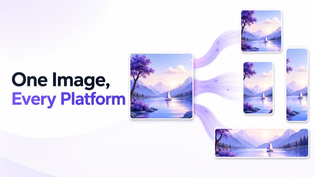
Resizing one image for multiple social platforms is not the same as exporting one crop at several dimensions. A landscape banner, square profile image and vertical Story cannot share the same composition without sacrificing something important. The efficient approach is to reuse the source, not force every destination to reuse the same crop.
Begin with a crop-friendly master image
Choose the highest-quality source available and inspect the space around the subject. A tightly framed headshot may work as a profile image but fail as a wide cover. A master with a clear focal point, simple edges and extra background gives you room to create both portrait and landscape variations.
List placements before opening the editor
Write down the real outputs: Instagram portrait post, LinkedIn cover, YouTube thumbnail, Facebook Page profile image, and so on. “Social media image” is too broad to guide a crop. A placement list prevents missing assets and makes it obvious which versions need text-safe space or a circular preview.
Generate frames, then make independent decisions
- Upload the master JPG, PNG or WEBP file.
- Select every platform used by the campaign.
- Generate the required preset frames together.
- Move and zoom the subject separately in every frame.
- Use Fill for edge-to-edge artwork and Fit when no source content can be removed.
- Review banners, circles and vertical placements at realistic display sizes.
- Export individual corrections or download organized platform ZIP folders.
Keep the campaign visually consistent
Consistency does not require identical crops. Preserve the same color treatment, subject, typography and message hierarchy while letting composition respond to each ratio. A face can be close in a profile image and smaller in a banner while the campaign still feels unified.
Handle text separately from photography
Text embedded in a master image is difficult to protect across several ratios. If possible, prepare a version with generous margins or keep text in a central region that survives common crops. Long headlines that fit a landscape thumbnail may become unreadable in a square post. Always inspect text at the approximate size people will see in a feed.
Choose export settings after the crops are approved
Use JPG for photographic campaigns, PNG for transparency or sharp flat graphics, and WEBP when the destination accepts it and smaller files matter. Check the JPG, PNG and WEBP comparison before committing to one format for the entire campaign.
SocialCropKit’s multi-platform crop tool keeps position, zoom, rotation and background settings independent for every preset, so correcting one crop does not disturb the others.
Build a campaign hierarchy before making crops
Multi-platform production becomes much easier when the message has a clear hierarchy. Decide what must be recognized immediately, what supports the message, and what is optional decoration. The primary subject may be a person, product or event title. Secondary information might be a date or short benefit. Background shapes and texture should remain expendable so they can be cropped without changing meaning.
This hierarchy helps every ratio make an intelligent compromise. A profile image may preserve only the face or symbol. A portrait feed post can include the subject and a concise headline. A banner may show the subject, headline and supporting environment. The campaign stays consistent because the identity and message remain stable even though the visible ingredients change.
Choose a focal point for each placement
Automatic center crops assume the middle of the source is always important. Real compositions are rarely that simple. A person may stand on the right, a product may need space for text on the left, or a landscape may rely on a horizon that should not be vertically centered. Treat every preset as a separate editorial decision.
Start with Fill to cover the frame, then reposition the source until the visual weight feels balanced. Zoom only as much as the placement needs. Excessive zoom magnifies quality problems and can make a campaign feel inconsistent. If the whole source must remain visible, switch to Fit and choose a background that supports rather than distracts from the primary image.
Adapt typography instead of shrinking it
Text is usually the first element to fail when one design is forced into many social media sizes. A long landscape headline can become tiny in a square and collide with interface controls in a Story. The strongest workflow keeps editable typography separate from the photograph and creates short, medium and full message versions.
- Use the shortest message on profile and thumbnail-sized assets.
- Keep feed headlines concise enough to read without zooming.
- Break lines intentionally in portrait layouts.
- Avoid placing essential text near the top and bottom of vertical interface-heavy placements.
- Check contrast against every part of the image, not just the desktop preview.
Maintain color and subject consistency across platforms
Consistency comes from a recognizable system rather than cloned geometry. Use the same color treatment, image selection, logo version and typographic personality. Keep skin tones and product colors stable across export formats. If a blurred background is needed for a fitted crop, use it as a supporting extension of the same source rather than introducing an unrelated gradient.
File naming also contributes to a professional workflow. Descriptive names such as campaign-linkedin-cover-1584x396.jpg are easier to review than random download identifiers. Platform folders reduce publishing mistakes and make approvals more efficient.
Quality control for a multi-platform image pack
Reviewing dozens of outputs can become mechanical, so inspect them in a deliberate order. Start with the smallest identity assets, because faces and logos must remain clear at tiny sizes. Move to banners, where responsive cropping creates risk. Review feed and vertical creative last, checking text size and interface overlap.
- Confirm every requested placement exists.
- Check that crop states differ where ratios require it.
- Verify circular masks without exporting the mask itself.
- Inspect text at realistic mobile size.
- Compare color and brightness across the set.
- Open representative files and confirm dimensions and format.
- Check ZIP folder names before handing the pack to a publisher.
Common shortcuts that cost more time later
Stretching an image to fit changes proportions and should never replace cropping. Adding large borders to avoid a crop can make artwork feel accidental. Reusing a compressed social download as the source reduces quality with every generation. Finally, treating platform dimensions as permanent can leave old templates in circulation long after a network changes its interface.
A repeatable system avoids those problems. Keep the master, the placement list and the independent crop decisions together. If the shape itself is unfamiliar, the guide to social media aspect ratios explains how common ratios influence composition. Then use the multi-platform image resizing workspace to build and export the final pack.
Frequently asked questions
Practical answers to common questions about resize image for multiple social media platforms.
01Can I use exactly the same crop on every social platform?+
You can reuse the source image, but each output should have an independent crop. Square, portrait, banner and Story frames need different focal-point decisions.
02What is the best master image for multiple crops?+
Use a high-resolution source with a clear focal point and enough space around important details to support both portrait and landscape frames.
03How do I keep a campaign consistent when every crop is different?+
Keep the subject, color treatment, typography and message hierarchy consistent. Composition can change to suit each ratio without weakening the campaign identity.
04Should text be included in the master photograph?+
Editable text is safer. Embedded text is difficult to reposition across wide, square and vertical frames, so prepare generous margins or separate text layouts when possible.